What Makes a Good Logo? 15 Good Logo Examples + 5 Modern Logos We Like
Your logo is often the first visual connection your audience has with your brand. It’s more than just a symbol; it’s your brand’s identity distilled into a single mark. Therefore, getting it right is crucial.
But what exactly does it take to create a logo that stands the test of time, resonates with your customers, and encapsulates the essence of your brand? This post dives into what makes a good logo and presents 15 good logo examples to inspire your creative and practical design process.
Elements of a Good Logo Design
What does it take to make a logo? The design elements of a good brand visual affect the overall success of your logo. These include:
Simplicity and Versatility
The best and most effective logos are often the simplest. A straightforward design can be scaled down to different sizes without losing its impact.
Think about the Nike Swoosh, Starbucks siren or Apple’s apple — they’re easy to reproduce on various media without losing recognition. A versatile logo ensures that you can use it on everything, whether it’s on a business card to a supersized billboard without any distortion or pixelation.
Relevance to Brand Identity
A great logo should tell a story and communicate the nature of your business. It should be an embodiment of your brand values, objectives, and what makes you unique.
Take the simple logo of FedEx, for example: the hidden arrow in speaks to their efficient and forward-thinking approach to logistics. The solid color palette and bold font convey a sense of reliability and professionalism.
Memorable and Timeless Design
A good logo is one that is memorable, standing out in the crowd so that it’s easily recognizable even without the brand name. Timeless logos don’t chase trends; they set them. Avoiding overly unique designs or trendy elements will mean your logo doesn’t date and has a long shelf life. Some designers make the mistake of trying to be too creative, which results in a logo that is difficult to read or understand.
Use of Appropriate Colors, Fonts, and Typefaces
The color and font choices in your professional logo are not just aesthetic — they are psychological. Color can evoke emotion and meaning, while font and type choice helps communicate your brand’s personality. E.g., the bold, sans-serif font of the Coca-Cola logo conveys strength and resoluteness.
Now, given these design tips, let’s explore 15 logos that excellently encapsulate these principles.
15 Good Logo Examples and Why They Work
Logo designers are always on the lookout for new ideas and trends to incorporate into their work. However, there are some logos that stand the test of time and remain iconic in the world of design.
1. Apple
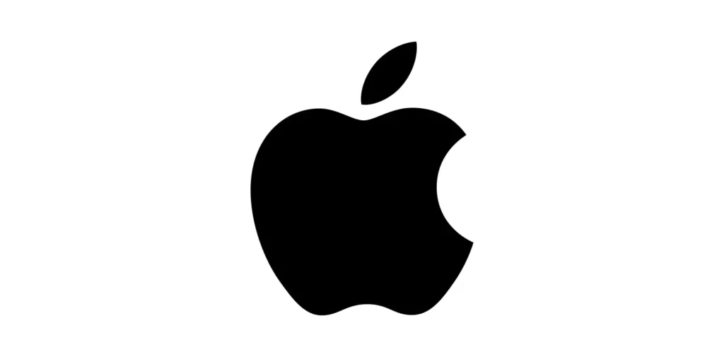
The Apple logo is a prime example of how a simple design can lead to immense recognition. The apple shape, bitten to avoid any confusion with a cherry, is a symbol of knowledge and wisdom, which perfectly aligns with brand personality. The monochromatic color scheme also suggests sophistication and straightforwardness.
2. Nike
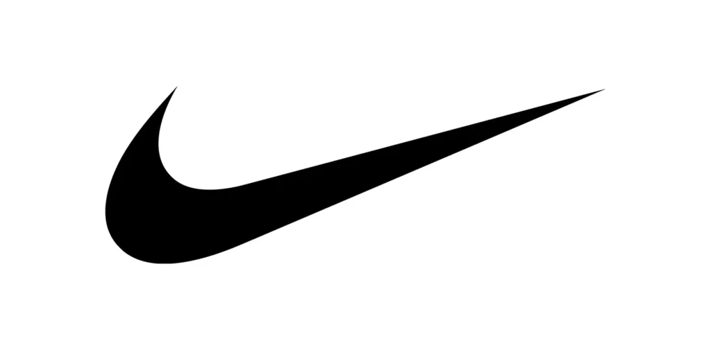
The Nike Swoosh is recognized worldwide, regardless of the marketing materials where it appears. It’s a simple yet dynamic design that suggests motion and speed, perfectly mirroring the brand promise of athletic excellence. The black color serves as a powerful contrast and can also be seen as a symbol of strength and boldness.
3. McDonald’s
The Golden Arches are a universally acknowledged symbol. This iconic logo is simple and memorable, evoking a welcoming “M” for “McDonald’s.” Red and yellow, the primary colors, are known to stimulate hunger and action, fitting perfectly with the fast-food industry.
4. FedEx
The FedEx logo is an excellent example of a logo with hidden meaning. The negative space between the “E” and the “X” forms an arrow, representing speed and precision — the core values of the logistics company.
5. Target
The Target logo encompasses simplicity, with an easy-to-remember red bullseye. This logo is inviting and creates a target for the consumer, visually leading them to the store. It’s a perfect example of a logo that’s also a call to action.
6. Volkswagen
The VW logo is a timeless piece; it’s a model of geometric beauty and symmetry, reflecting the brand’s ethos of order and engineering precision. With its sleek and modern look, it feels like it could have been designed yesterday.
7. Amazon
The Amazon logo is cleverly designed, with the smile-shaped arrow pointing from “A” to “Z,” suggesting that Amazon offers everything from A to Z. It’s hidden, but once seen, it’s hard to unsee, making it a delightful element of their overall design and branding.
8. Coca-Cola
The Coca-Cola logo has barely changed since the 19th century, and for good reason. It manages to combine a sense of tradition with a touch of retro, while still feeling remarkably modern. The script font is as classic as the brand itself, and the red color is one of the most vibrant and recognizable in the world.
9. BMW

The BMW logo is a stylized, rotating aircraft propeller. It dates back to the company’s roots in aviation technologies before World War II and signifies movement and progress. The circular shape reinforces a sense of completeness and the colors, blue and white, harken to Bavaria, the company’s birthplace.
10. Google
The Google logo is symbolic of the brand’s playful and approachable nature. The use of four primary colors suggests diversity and inclusion, and the unconventional, child-like font reinforces the brand’s commitment to creativity and innovation.
11. Mercedes-Benz
The Mercedes-Benz logo is an impressive piece of design with a sense of history and a nod to royalty. The tri-star represents the brand’s dedication to the air, land, and sea — and is now recognized as a sign of luxury and top-notch engineering.
12. Lego
The Lego logo is deceptively simple. The bold, primary colors and the rounded, child-friendly font communicate its target audience effortlessly while also hinting at fun, creativity, and reliability. The negative space inside the ‘O’ creates a stud—a core element of the Lego building system.
13. Chanel
Chanel’s interlocking C’s epitomize class and simplicity, two aspects deeply ingrained in the brand’s ethos. The black and white combination is both stark and striking, reflecting a design principle often associated with the luxury brand.
14. Toyota
The Toyota logo is simple and instantly recognizable. The three ellipses represent the heart of the customer, the heart of the product, and the unity that binds them together. This unity is also celebrated in the sweeping circular motion of the logo.
15. Spotify

Spotify‘s green and black logo not only represents its brand name but also signifies growth, energy, and innovation. The three curved lines forming the equalizer symbol represent technology, data streaming, and entertainment – all important qualities that make the popular music streaming platform.
5 Modern Logos We Like in 2024
1. SpaceX
The SpaceX logo encapsulates the essence of exploration, ambition, and the future. Its sleek, forward-leaning typography suggests speed and innovation, while the white-on-black color scheme evokes the vastness and mystery of space. This logo perfectly mirrors SpaceX’s mission to make space travel commonplace and humanity multiplanetary.
2. Airbnb
Airbnb‘s logo, known as the “Bélo,” represents belonging, with its shape suggesting both a heart and a location pin. This clever design encapsulates Airbnb’s ethos of finding a home away from home, anywhere in the world. The simplicity and warmth of the logo mirror the brand’s focus on community and shared experiences.
3. Slack
Slack‘s logo, a hashtag or octothorpe, is a direct nod to the platform’s purpose of bringing teams together. The colorful, interconnected shapes embody collaboration and communication, core to Slack’s functionality as a workplace messaging app. Its redesign in recent years aimed to simplify and make the logo more recognizable across different contexts.
4. Tesla
Tesla‘s logo is as sleek and futuristic as its electric vehicles. The stylized “T” represents the cross-section of an electric motor, hinting at innovation and clean energy. The simplicity and sharpness of the logo suggest a leap into the future of automotive technology, perfectly aligning with Tesla’s vision.
5. Beyond Meat
The Beyond Meat logo represents a shift towards sustainable eating habits without compromising on taste. The green leaf in the word “Beyond” emphasizes health and sustainability, core values of the brand. This logo appeals directly to a growing demographic looking for plant-based alternatives, encapsulating the essence of innovation in food technology.
What Makes a Good Logo? Design Tips for Small Businesses
A small business logo can significantly impact customer perception and marketing effectiveness. As it is the face of your brand, yours should:
Impact First Impressions
It’s often the first thing a potential customer sees. Well-designed and memorable logos can convey professionalism, trustworthiness, and competence from the outset.
Attract and Retain Customers
A good logo can create an emotional connection with your target audience, promoting brand loyalty and retention.
Make Your Logo Stand The Test of Time. Contact The Logo Factory For Expert Advice on Strong Logos That Make a Mark.
Your logo is the bedrock of your brand identity. It’s not something to take lightly or skimp on.
By investing in a good, professionally designed logo, you’re setting up your business for recognition and trust in the long run. It’s an asset that can distinguish you from competitors, connect with customers, and withstand the test of time.
If you’re a small business owner, take the time to consider these logo design principles when crafting or redesigning yours. And if you’re a graphic designer, make sure your logos reflect these principles to offer the best value to your clients. Looking for templates to get started? Reach out to our team and start building your brand story.
The Logo Factory doesn’t just help you design a logo; we help you establish an identity. We understand the importance of a logo in building your brand’s visual representation and we work closely with our clients to capture their unique essence.
Our team of experienced designers will collaborate with you to create a logo that reflects your company’s values, mission, and personality.
Explore our services and find out how we can work together. Schedule a consultation today.
RECOMMENDED POSTS
CONTACT US
LATEST ARTICLES
